Building a personal brand can be a big boost to your career, business, or cause. Personal branding offers you a blueprint to success in any of your endeavors. If you are looking to grow your business or career, a personal brand sets a foundation. In this turbulent economy, income can be hard to come by. So you want to make sure you are protecting your investment. Think about all you have invested in getting where you are right now: education, jobs, relationships, extracurricular activities, even your personal brand. Personal branding isn’t just a buzzword. It’s a proven strategy to help others see what YOU have to offer. A personal brand is a mixture of the characteristics and perceptions that you offer to your customers. Here are 10 handy checklists that will immediately raise your company’s brand and online presence. So without further ado, let’s dive right into it.
What is a Personal Brand?
A personal brand is an intangible asset that helps to describe ‘yourself’ to the world and is something consistent that helps people to identify what they can expect from you and what you offer.
A strong brand represents the essence of who you are professionally and who you aspire to be. It sets the tone of your future and how everyone sees and understands you. Your brand is built on and encompasses your values, strengths, experiences, knowledge, vision, and personality. It brings everything you have into one concise, honest, and engaging package.
Personal branding is not new. We have probably all heard of great brands such as Apple, Google, or Nike. These successful corporate brands are associated with the best and most innovative products, and they achieved this due to their incredible personal branding strategies.
Why should you start building a strong Personal Brand?
With a well-known and reputable personal brand, you will be able to build trust, make a positive impact on society, gain more clients and followers, giving you more revenue and satisfaction.
One of the best personal branding examples is Neil Patel. He runs NeilPatel.com, a well-respected blog with over 100,000 subscribers, and has monthly traffic of more than 350k. His work regularly appears on industry-leading sites, including Forbes, Inc., and Mashable. He’s a super active blogger who is responsive to feedback and highly active on social media. He uses only two colors (white and orange) on his website. Orange is used to draw attention, and it represents brightness, happiness, and uplifting. This makes his website visually simple and effective at the same time.
His blog posts and videos are easy and powerful at the same time, which creates a long-lasting impression. As a result, people tend to visit his website and youtube videos more, which makes people buy his services, like Ubersuggest and NP digital.
Building a personal Brand – Ultimate Checklist
Building your personal brand can be daunting at first. You must be thinking that you have to create content in bulk, actively participate in networking events, collaborate with thought leaders, create a solid LinkedIn profile. And you are right to some extent, but to grow big, we have to start taking small and effective steps in the right direction first. So, in this list, I will break this up for you and show you effective personal branding strategies that actually work. So without further ado, let’s dive right into it.
Do you have any professional photos of yourself on your website?

You should use the best photographs of yourself. This reflects that you are passionate about yourself. I would suggest using high-quality pics taken with a professional camera rather than low-quality ones taken with your cellphone.
Because market competition is fierce and everyone is trying to get the attention of your potential clients, you need to look professional at all times. Thus, the pictures on your professional social medial channels and your business website need to be perfect. Photos of yourself should be harmless and showcase your personality and professionalism. To achieve this, contacting professionals in this field is one of the best choices you can make for your startup. That is why professional website photos are essential for the successful outcome of any business.
Do you have a logo that was designed by a professional?
A professionally crafted logo helps you distinguish your business from the others, and it’s a key element to brand recognition and conveys the essence of your company’s brand. Additionally, It demonstrates that your corporate brand has its own identity and unique values to offer.
A logo and a personal brand online website are the faces of your business, and they should both be perfect for leaving the first and best impression on your prospective customers. But, unfortunately, many times, business owners tend to ignore logo designing because it’s just a small picture in the corner of the website. But, on the contrary, your logo, especially your business brand logo, is one of the first things a potential customer recognizes on your website or even on your business card. And that one glance is more than enough to make his mind to purchase from you or your personal website not.
Less of a logo is more. The logo design should be simple, neat, and appropriate to any situation and usage. It should also be creative and memorable as the logo leaves a very first and last impression on a potential customer. Use your logo as a tool to showcase your branding.
If you want to find a graphic designer for your logo design, Fiverr and Freelancer websites are the easiest ways to begin, or you can reach out to us. We normally provide logo design free with our complete personal website package, but we can make an exception for you and make it with a small fee if it brings a smile to your face.
Is it easy to see and understand your Unique Service Offering?
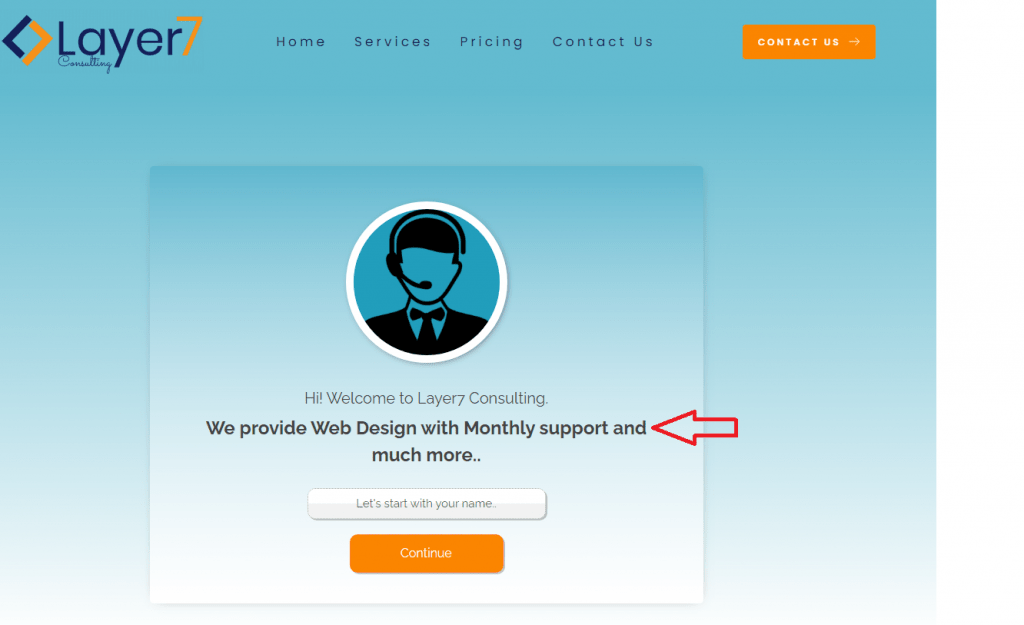
A unique service proposition is a feature that makes you unique and stands out from your competitors in your specific niche. In business, your Unique Service Proposition is an essential part of your marketing and sales strategy.
Bear in mind that the Unique Service Proposition (USP) sums up exactly what you do and how you assist others. Therefore, your USP should be big, bold, and clearly noticeable when anyone visits your website.
It should grab your customers’ attention and make them want to find out more about your products and services. It should explain why your business is different from the competition’s and incorporate a strong call to action.
Additionally, It should be visible above the fold and in the foreground. Consider it similar to an elevator pitch or a newspaper headline. Always make an easy way for visitors to understand what you do.
In short, it should be compelling, replicate-able, easy to understand, and memorable.
Check out our home and services page, and let us know what you think.
Do you have testimonials on your site?
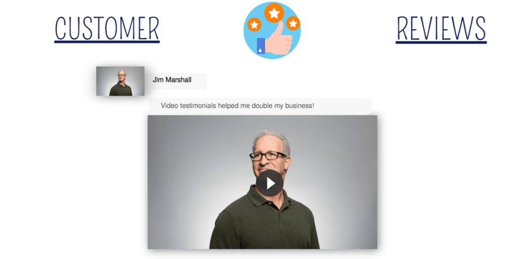
Testimonials are considered one of the most powerful forms of “social proof.” for any corporate brand or business brand.
A testimony is a first-person, authentic story about an experience of a service or product.
The power of words in an authentic story is unbeatable. The value of a product review is when the new customer reads a review written by an earlier user about the product and is then convinced to buy it. This works magnificently.
A customer can often find value in another customer’s testimony. For example, storytelling convinces people to try or buy another person’s products or services.
An authentic story also makes the website look legitimate and gives credibility.
Further, testimonials demonstrate that you can actually follow through with your promises. That you are capable of successfully resolving complex issues of different people and assisting them in significant ways. At the very least, your personal website should have some main testimonials. The best strategy is to use the ones in which you achieved the greatest results for a client.
Is there a clear call to action on your website?

Your call-to-action button should always be prominent and placed in the most noticeable area on the personal brand online website page. Whether it is your homepage, the product page of your online store, or any other page on your website, you should always make sure that your call-to-action buttons are immediately visible to your visitors.
What do you want visitors to your website to do when they arrive? Do you want them to subscribe to your newsletter? Attend a webinar? Follow you on Facebook, Twitter, etc.? Or schedule a free consultation? Whatever it is, make it crystal clear and easy to follow.
At the same time, you should also test to see what call-to-action button your visitors respond to the best. If your call-to-action button is not getting any clicks from your visitors, you should know that you need to change it. Likewise, if your visitors are not interested in clicking on the button you have decided to place there, you should change it with one they will click on.
A Call to Action (CTA) button (such as “Contact Us,” “Shop Now,” or “Download now”) is an important tool on your Website and Landing Page. CTAs enable you to collect feedback, launch new products, increase sales, and grow your company. You can further use google analytics to measure their effectiveness.
For a CTA to be valuable, it must lead to the desired outcome—whatever that may be for your website. So whether you’re a B2B or B2C company, you want your customers to take action and continue doing business with you.
Pro-tip:- To get attention, I would suggest using a pop-up window, but make sure it shows only once and must be subtle and to the point.
Another Pro tip:- Button color is critical. Because of its small size, its color must be bright and highlight. Good colors to attract attention are red, orange, or green because they are the most visible colors and draw attention to the website visitor. In addition, orange is one of the most affecting colors for encouraging action.
Check out our home and services page and let us know what you think
Do you have a reassuring “About” page on your website?
Your “About” page tells your story while still reiterating your Exclusive Service Proposition. It’s a space where you can discuss why you do what you do. Why are you so committed to assisting others? Explain how you got to where you are now and your goal on your “About” tab.
For the most part, most people use their about page as a chance to let everyone know what they’re all about. Of course, you could fill this page with cheesy “bragging rights” and tell everyone how cool you and your business are, but honestly, do people want to hear that? Of course not.
You need to fill this page with information and recognizable slogans that are actually useful to people. This page should serve as a way for you to show people why they should choose you over your competition. Let them know what makes you or your company worthy of their hard-earned cash.
Do you have a simplified “Services” page on your website?
Your services page should clearly outline all the various services you provide and what each service includes. Be as specific as possible when listing the components of your services. For example, you may wish to offer clients the option of signing up for a complimentary strategy or consultation on your services page.
Check out our home and services page and let us know what you think
The customer journey starts from the homepage. Our home page is designed to be brief and clear. We have a list of core services most suitable for our target audience and serve as a gateway to the site. On the bottom of each service indicates “Learn more.” This is designated as a link to the services page that outlines other services that we offer.
Do you have free resources for your customers?
We all like free things. So on your website, at the very least, you should have some free resources. This is an excellent way to provide value to all visitors of your website. This will also showcase your knowledge the moment someone comes into contact with you.
What sorts of free resources work well?
- Reports
- Blog posts
- Podcasts/audio interviews
- eBooks
- Videos
- Email courses
- Webinars
Whether your customers need a quote, a price list, or information on a product, you can provide your customers with quick, easy, and free access to the info they need to buy your products and services.
The awesome idea is to Create a knowledgebase:
A knowledgebase is a site or section of a larger website that contains educational information for a business’s customers and clients. For example, it can contain questions and answers about a business’s services, quality control standards, shipping and payment policies, and other company policies. It also allows customers to go to the site if they have a question, which will answer it for them. By creating a knowledge base, you will be able to develop a long-term relationship with your customer.
More ideas on free resources you can provide to your customer to boost your company’s brand:
A free trial, a limited version, a consultation in exchange for information, a library of videos, a knowledge file that each user can consult on demand, a help forum, an online community, a subscription: you will have to choose the most cooperative with your customers.
We are providing a Free in-depth SEO report of your website for a limited time; please fill the form below or reach out to us. If you want to learn more about our SEO report, please read our services section.
Have you included links to all of your social media accounts?

Using your website to gain more followers and public relations on social media is a smart strategy for your brand. Most of your visitors would like what they see on your blog and probably be interested in following you through all of your social media channels. So place your social media links in ways that are readily accessible to all customers. Then you can further engage your customers through interesting and informative posts.
We have not created any Google my Business, Facebook, Instagram, or Youtube channels so far, but we plan to do in the future when we expand.
Here are some best ways you can engage customers through social media.
1) You can create a page for your business and make it public, asking people to join it. You can select the type of person who will see the page, namely friends of friends or anyone. This way, you can build a following from the natural kind of sharing on social networks.
2) Create a fan page. Make it look similar to a Facebook page. You can use plugins to manage such a page. For example, invite people to join you automatically by creating a widget to be automatically placed on your website.
3) You should always try to post good content on your social media accounts. Whether they are an article, image, or even video, the post made can be any form whatsoever; always make sure that you have made a post representing you well. This will make people come back to your page to check it out to see if you have posted anything else. This will also allow you to have many followers on your social media sites by making some simple effort and getting active on your page.
The list will go on and on, more on this in a separate blog post. So let me know if you want us to write a blog post on this topic.
Do visitors have a way to reach you?
Naturally, you want website users to be able to contact you. If you want to turn visitors into customers, it’s critical to have an easy-to-navigate and clear contact page. You may wish to provide visitors with several contact methods on your contact page—for instance, general requests, collaborations, speaking engagements, and media interviews.
The contact us page is a valuable resource for considering your potential customer’s valuable time when faced with perhaps a million and one other alternatives when they are actually ready to purchase something. This is particularly the case when you are running a website and you are simply looking to build a reference base to build a mailing list of people interested in what you are selling later on.
Please check out our contact us page, where we have made two separate forms, and each form will provide you options to choose and inquire about our services. We have even put an interactive form on the homepage to make the process easier for our visitors.
Conclusion – You’ve Made it to the End of This List!
Wow. Quite the list. Thanks for following through with the 10 tips on building a personal brand. Go on and redefine your brand that everyone will love. You now have the right tools in your arsenal, which one of the above-mentioned checklists you will try first?
Here’s a quick recap that should make you feel very proud of all that you’ve accomplished.
- Do you have any professional photos of yourself on your website?
- Do you have a logo that was designed by a professional?
- Is it easy to see and understand your Unique Service Offering?
- Do you have more than one testimonial on your site?
- Is there a clear call to action on your website?
- Do you have a reassuring “About” page on your website?
- Do you have a simplified “Services” page on your website?
- Do you have free resources to your customers?
- Have you included links to all of your social media accounts?
- Do visitors have a way to reach you?
